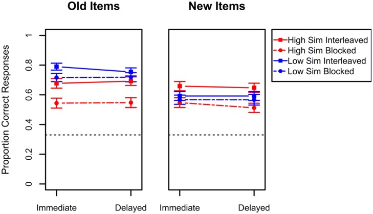
FIGURE 3.
Performance in the transfer tests of Experiment 1A. The left panel depicts results for items studied during the study phase while the right panel presents results for items not seen during the study phase. Results for the high similarity categories are presented in red while results for the low similarity categories are presented in blue. For each of these, the dashed lines represent blocked study while the solid lines represent interleaved study. Error bars indicate standard errors of the means. Chance-level performance in this task was 0.33 and is represented in the graphs by the black dashed line.

