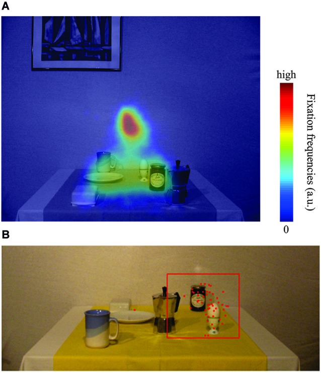
Figure 3.

(A) Heatmap of relative fixation frequency during the encoding phase plotted against an example encoding image. Blue colors denote few or no fixations, whereas red colors denote many fixations in that region. (B) Typical example plot of reaching endpoint towards the egg in one of the 18 configurations. Red dots are reaching endpoints from individual trials (local + global). The red square represents the outlier criterion of 2.5 SD relative to the mean reach endpoint in the control condition. All data within the red square have been considered for data analysis, data points outside have been treated as outliers.
