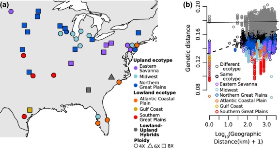
Figure 2.

Geographic patterns of genetic diversity. (a) Map of populations. Colour corresponds to inferred regional gene pool, and shape corresponds to predominant ploidy. (b) Patterns of isolation by distance shown by all pairwise comparisons of genetic and geographic distance. Grey = between ecotypes. Black = within ecotype. Colours = within each regional gene pool. Lines representing the linear regression of all between-ecotype comparisons (solid line, slope = 3.5 × 10⁻⁴) and all within-ecotype comparisons (dashed line, slope = 9.4 × 10⁻³) indicate greater IBD within ecotypes than between ecotypes.
