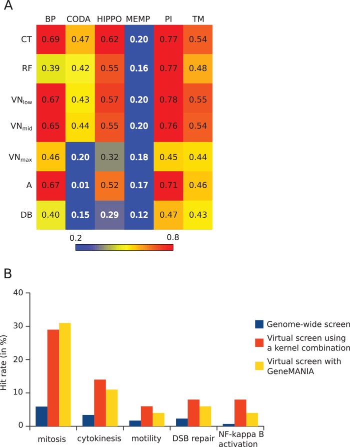
FIGURE 2:
Summary of bioinformatics tests of the gene selection method. (A) Kernels on graph nodes differ in their global performance at information retrieval: heatmap view of areas under the curve (AUC) of true positives vs. false positives for all kernels and data sources tested. Colors go from blue for low values (<0.2) to red for high values (>0.8). Data sources are in columns: BP, semantic similarities across GO biological processes; CODA, predicted interactions based on domain co-occurrence; HIPPO, protein interactions from other species mapped to human; MEMP, gene coexpression network; PI, protein interactions in human; TM, iHOP-generated interactions. Kernels are in rows: CT, commute time; RF, random forest; VN, Von Neumann diffusion; A, adjacency matrix; DB, degree-based similarity. (B) Screening of selected genes outperforms genome-wide screening. For each screen, the hit rate is expressed as percentage of tested genes having the desired phenotype. For virtual screens, the tested genes are the top 100 predicted genes, and the numbers represent the fraction of these that were found as hits in the corresponding genome-wide screen.

