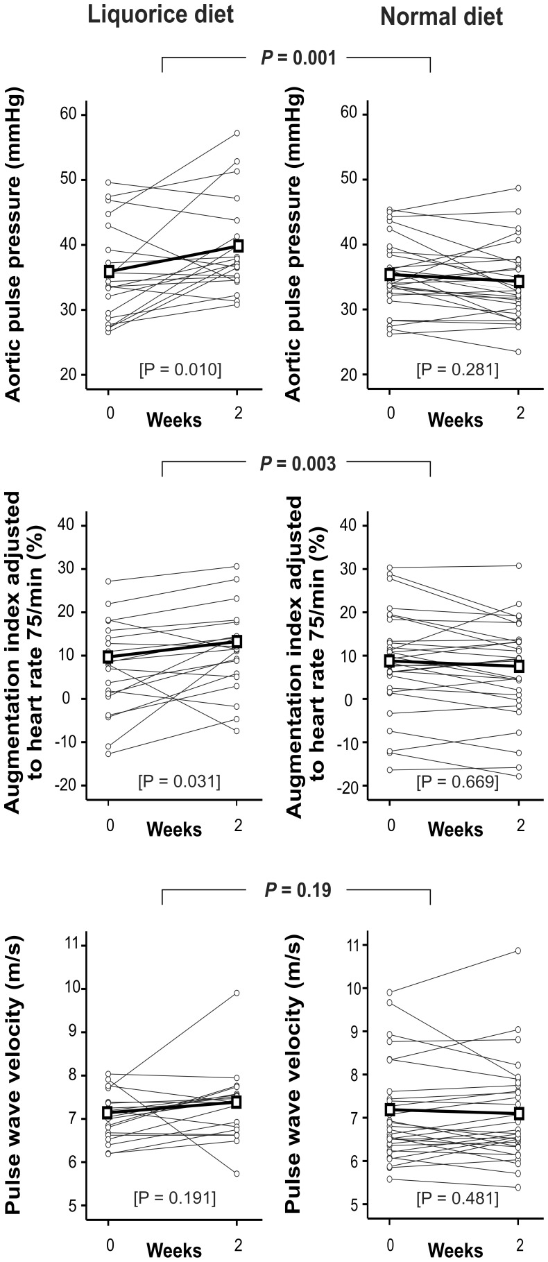
Figure 3. Aortic pulse pressure, augmentation index, and pulse wave velocity, liquorice diet versus normal diet.
Grey lines represent each individual, thick black line represents mean values of each variable. P values are for the difference in the change of each variable between liquorice diet versus normal diet, P values in brackets are for the change within each group, n = 20 and 30 in the liquorice and normal diet groups, respectively.

