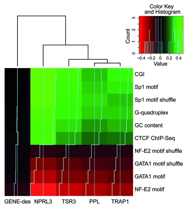
Figure 5. Heat map representing the correlations between the density of various genomic features (rows) and the 4C signal for different anchors (columns). As a control for the motif nucleotide content, motifs with shuffled positions were analyzed. The color represents the correlation value; black corresponds to no correlation, and light green or red correspond to positive or negative correlation, respectively. The histogram in the top-right corner shows the distribution of the correlation values presented in the heat map.
