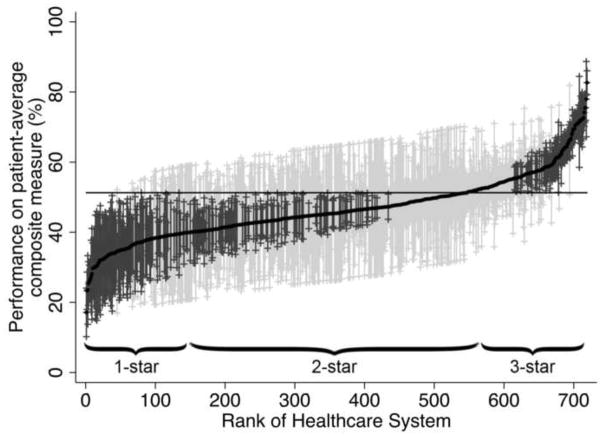
Figure 1.
Variation in performance on the patient-average composite measure across the 719 healthcare systems. The solid black line represents the adjusted performance rate for each healthcare system. The horizontal line represents the adjusted overall mean rate of performance. Error bars represent 95% confidence intervals for the rates of the individual healthcare systems. Black error bars represent rates that are statistically significantly different from the overall mean. Grey error bars represent rates that are not significantly different from the overall mean.

