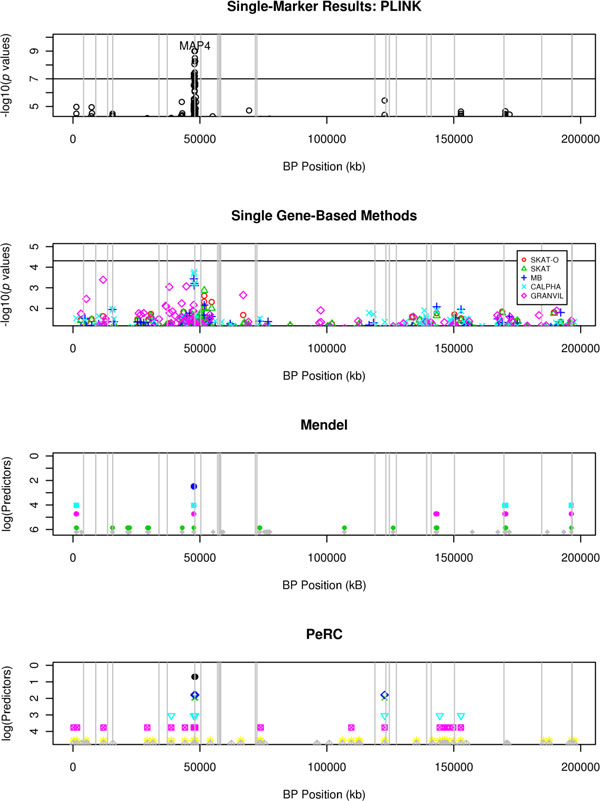
Figure 1.

Results for simulated DBP. The top 2 plots report the −log10(p values) for the PLINK and the single gene-based methods, respectively. A horizontal line is drawn at the significance threshold. The points on the last 2 plots represent the predictors for Mendel and PeRC, respectively. In Mendel, the model size, or number of predictors, is selected by the user, and in PeRC, the magnitude of κ determines model size. Each model is represented by a different color, and the y-axis corresponds to the number of predictors in the model on the log scale. Vertical lines are drawn at the causal genes.
