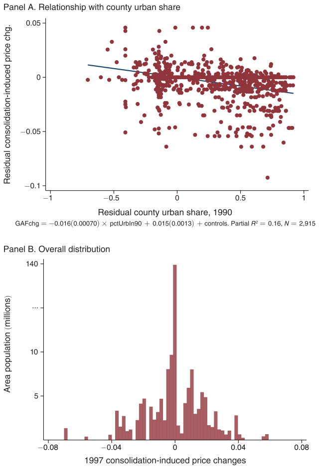
Figure 2. Distribution of Consolidation-Induced Price Shocks.
Notes: Panel A shows the relationship between the county-level changes in the Geographic Adjustment Factor (GAF) from Figure 1 and each county's urban population share in 1990, after controlling for state fixed effects. Letting i denote counties, s(i) each county's state, and ΔRRi the reimbursement rate change from Figure 1, we estimate:
across a cross section of counties. Panel A plots the residuals resulting from these regressions. Panel B shows the distribution of the county-level changes in the GAF, weighted by county population. Note that the y-axis scale has been adjusted at the high end to accommodate the large number of counties in states with no price change.
Sources: Price change: Federal Register, various issues; county population: US Census.

