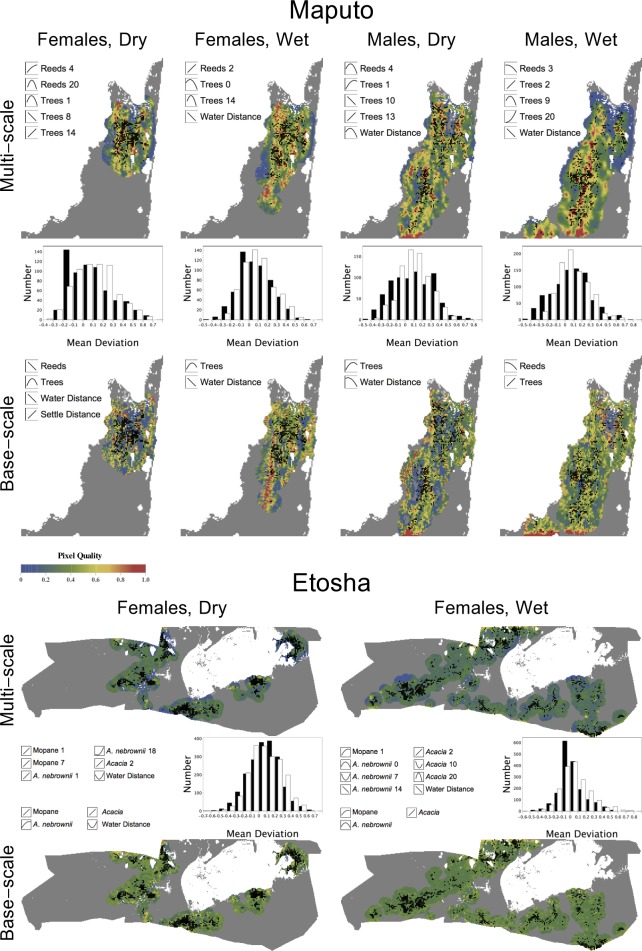
Figure 7. Local relative quality maps.
The maps were overlaid with the endpoint of each movement for all elephant data sets, representing the composite of all variables present in the best multi-scale model and the original, base-scale variables only. The histograms show the comparison between the mean deviation of the probability values of the multi-scale maps (white) and base-scale maps (black). The variables at their optimal scale(s) are shown with the shape of the elephant’s relationship to each variable.

