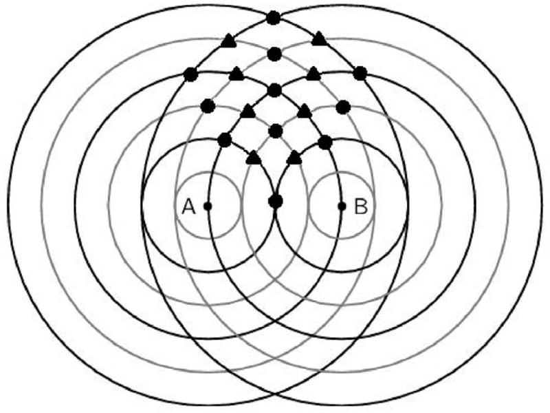
Figure 1.

Wave interference pattern. “A” and “B” are two people standing near each other. The black lines are peaks and the grey lines are troughs. The circles indicate areas where the two waves enhance one another (either higher peak or lower trough). The diamonds indicate areas where the two waves cancel each other.
