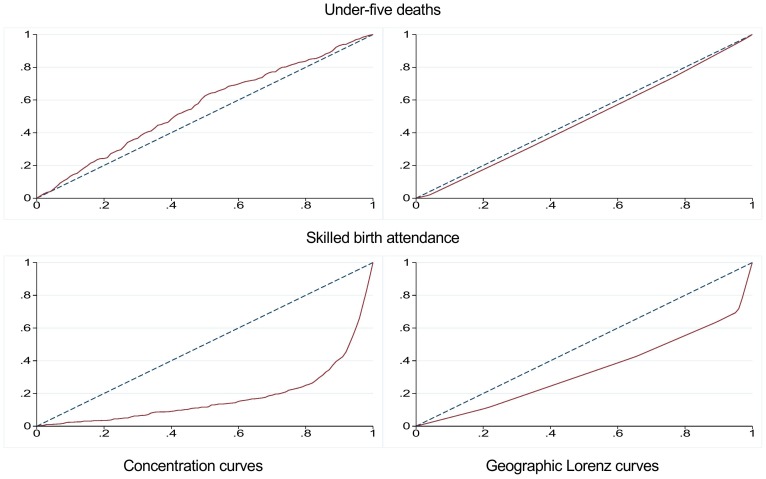
Figure 1. Concentration curves and geographic Lorenz curves for under-five deaths and skilled birth attendance in 2011.
The two figures to the left are concentration curves, with the cumulative proportion of the individuals ranked by wealth on the x-axis and the cumulative proportion of the outcome variable on the y-axis. The two figures to the right are geographic Lorenz curves, with the cumulative proportion of the regions ranked from worst to best achievement of the indicator, and weighed by population size on the x-axis. The cumulative proportion of the outcome variable is on the y-axis. The solid red lines represent the concentration and Lorenz curves, and the dashed blue lines represent the “line of equality”.

