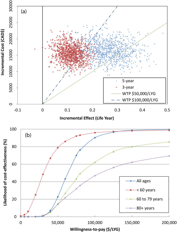
Figure 4.

Incremental cost-effectiveness ratio scatterplot and cost-effectiveness acceptability curves. (a) Top - Scatterplot for incremental cost-effectiveness ratios (ICERs) for all ages based on bootstrapping. Each point represents the mean incremental cost and effectiveness of RCHOP compared to CHOP. A shift of distribution of ICERs from a 3-year to a 5-year timeframe is demonstrated. (b) Bottom - 5-year cost-effectiveness acceptability curves for different age groups. The curves represent the probability RCHOP is cost-effective compared with CHOP based on a willingness-to-pay threshold for the ICER.
