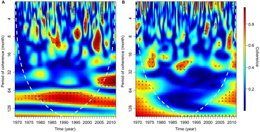
Figure 6.

Wavelet coherence between (A) Buruli ulcer incidences per 100 000 people and the rainfall trend obtained from SSA. (B) Buruli ulcer incidences per 100 000 people and ENSO. The colors are coded from dark blue to dark red with dark blue representing low coherence through to high coherence with dark red. The solid black lines around areas of red show the α=5% significance levels computed based on 2000 Monte Carlo randomizations. The dotted white lines represent the cone of influence; outside this area, coherence is not considered as it may be influenced by edge effects. The black arrows represent the phase analysis and adhere to the following pattern: arrows pointing to the right mean that rainfall and cases are in phase, arrows pointing to the left mean that they are in antiphase, arrows pointing up mean that cases lead rainfall and arrows pointing down mean that rainfall leads cases.
