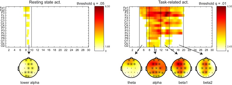
Figure 3.
Sensor x frequency maps displaying the significant clusters (in the power spectra) for the NF group in the within-group (pre vs. post) comparison. Left figure displays the resting state activity, and right figure the task-related activity. Significant clusters are shown at a given q threshold. X axis shows the frequency bins in the (1–30 Hz) frequency range, whereas Y axis shows the sensor locations. Topoplots are displayed in the frequency bands with power changes above the q threshold (in significant clusters), and the involved sensors are marked with a cross. Color scale represent t-values, indicating a power increase after the NF training.

