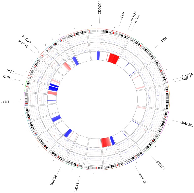
Figure 4. Summary plot for BRCA dataset.
A circle plot that shows the differentially expressed genes result from RNASeq and microarray platform (Inner circle 1 and 2, y axis represents the fold change value, red dots are up regulated and blue dots are down regulated in cancer samples), copy number changes (inner third circle, blue zones represents the deletions and red circle represents the amplifications) and outer circle shows the genes that has mutation at least 5% of samples.

