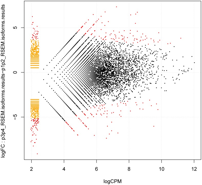
Figure 10. Graphical visualization of significantly differentially expressed genes versus transcripts as designed by the RSEM software.
The y-axis indicates differences in the logarithms between the expression of the ‘g’ gene of the sample K, K ', while the x-axis indicates the average of the logarithm for the expression of the ‘g’ gene of the sample K, K '. log CPM: the average log2-counts-per-million.

