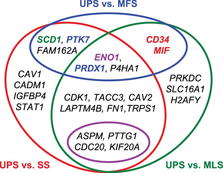
Figure 6. A Venn diagram of gene classification based on pairwise comparisons of histological types using Welch’s t test.

Genes inside the red circle were statistically significant (q <0.05 calculated using Welch’s t test and the BH method) in the comparison of UPS with SS. Genes inside the green oval were statistically significant (q <0.05) in the comparison of UPS with MLS. Genes inside the blue oval were statistically significant (q <0.05) in the comparison of UPS and MFS. Genes inside the pink oval are common to CINSARC and our 25-gene set. For PCA of the 9-probe set, MIF and CD34 highlighted in red were the first and third largest contributing coefficients to PC1, respectively. PTK7 and PRDX1 highlighted in blue were the first and second largest contributing coefficients to PC2, respectively. ENO1/MBP1 highlighted in purple was the second largest contributing coefficient to PC1 and the third largest contributing coefficient to PC2. SCD1 highlighted in green was the largest contributing coefficient to PC3.
