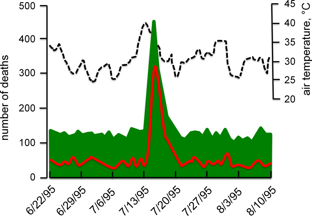
Figure 2.
Mortality (green shaded area and red line) and maximum daily temperatures (dashed line) during the summer 1995 Chicago heat wave. Dates are shown along the x-axis. Mortality data in green represent the total death toll, while the superimposed red line depicts deaths from cardiovascular causes alone or from death certificates that mention combined cardiovascular and heat causes. Redrawn from Kaiser et al., American Journal of Public Health 2007, 97 Suppl 1:S158-62; APHA Press (35).

