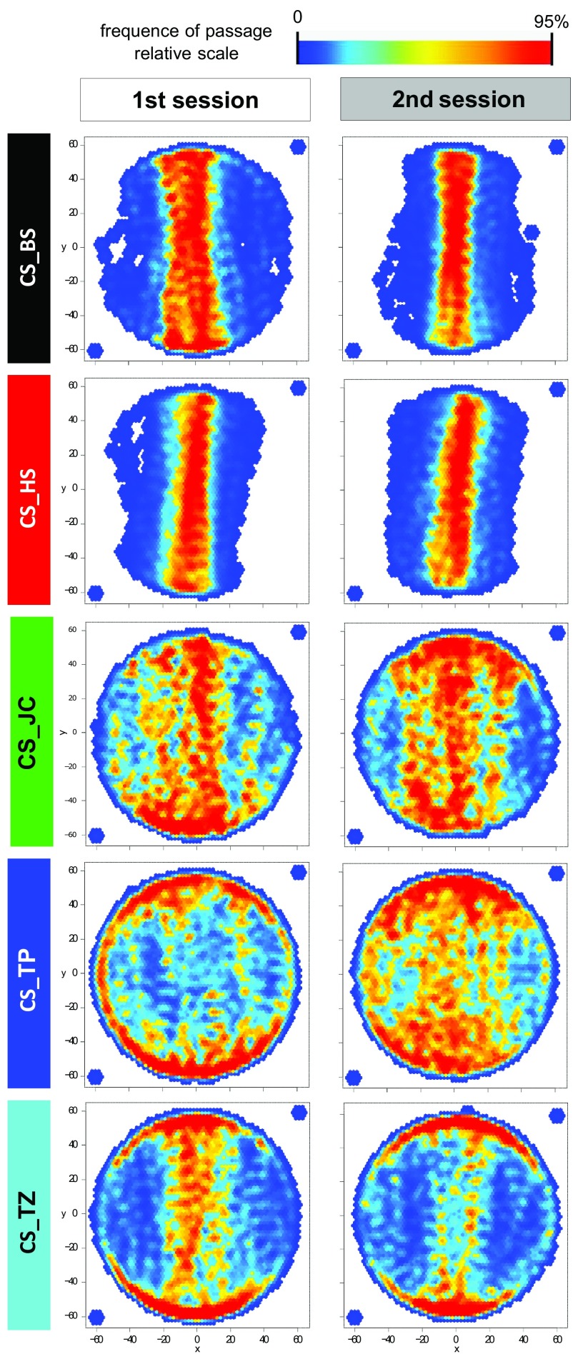
Figure 1. In transition plots, the behavior of each sub-strain looks different from the other strains and similar between the two experimental sessions.
Transition plots represent the position of the fly on the platform, excluding the time when the fly was immobile. The scale is proportional, with red points meaning that the number of times the fly was in that position is at least 95% of the maximal score obtained for any position. A Gaussian smooth was applied to the resulting heat map. The two points outside the platform were added manually to assure orthogonal axes of the representation. Sample size is 11–12 for each plot.

