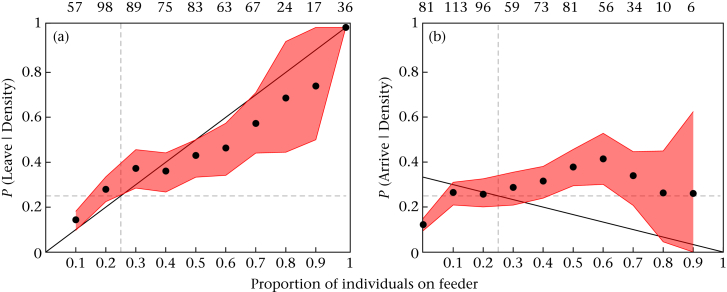
Figure A3.
Within-patch movements with respect to distribution of birds across the four feeders for day 1 only. Circles represent observed probability of moving given the proportion of individuals at the feeder when (a) leaving and (b) arriving. Feeder densities (proportions) were calculated using the number of birds present at each feeder divided by the number present in the whole patch. The shaded envelopes are the maximal variability range from 1000 jackknife estimations with 40% of the original data removed. The horizontal and vertical dashed lines represent mean/random expected density on each feeder (0.25) in the absence of any collective behaviour. The solid black lines indicate the density-dependent expectation of the theoretical asocial prediction (TASP). Values above each plot give the sample size (n departures or arrivals) for each data point below it.

