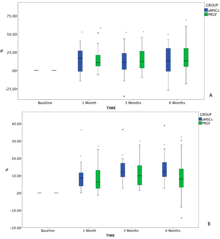
Figure 2.
Changes in VAS from baseline value assessed by the owner (A) and the investigator (B). The changes in VAS which differed significantly with baseline (p < 0.05) are marked as *. The circles, both green and blue, correspond to anomaly/outlier data included in the statistical study. The blue asterisk corresponds to an outlier, to which the Dixon Q test was applied in order to confirm deletion of the value from the database.

