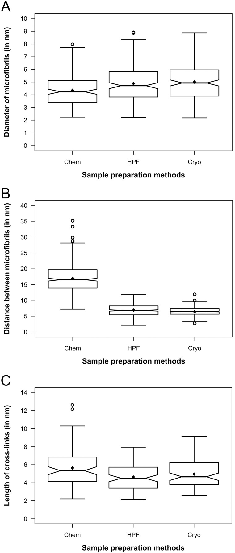
Figure 5. Notched boxplots showing quantitative comparison of cell wall preservation quality in electron tomograms.
Cryo = Cryo-tomograms of vitreous sections. HPF = Tomograms of high pressure frozen, freeze-substituted samples. Chem = Tomograms of chemically prepared samples. The thick band inside the box is the median, and the bottom and top of the box are the first quantile (Q1) and the third quantile (Q3), respectively. The ends of the whiskers represent the range of data within 1.5 *IQR (Interquartile range; IQR = Q3−Q1) from the lower quantile (Q1) or the upper quantile (Q3). The notch displays deviation around the median ±1.57×IQR/sqrt of n (where n is the sample size), and approximately shows the 95% confidence interval of median, so that if the notches of two boxes do not overlap, their medians are usually significantly different. The diamond (⧫) represents the mean, and the circles ( ) represent any outliers. A. Diameter of microfibrils, n = 180. B. Edge-to-edge distance between microfibrils, n = 450. C. Length of cross-links, n = 90.

