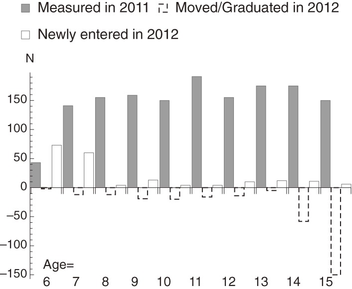
Figure 1.
The age distribution of subjects measured in the winter of 2011 (gray bars). Of these children, those who graduated or left the town are indicated by dashed bars, while the white bars indicate children who were newly enrolled in 2012. This graph shows that the mobility of Miharu children is rather low.

