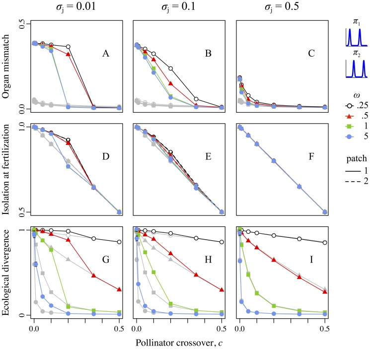
Figure 3. Reproductive-organ–height mismatch, reproductive isolation at fertilization, and ecological divergence as a function of the pollinator crossover probability, strength of selection, and precision of pollen transfer for scenario 1, involving the pollinator pair “bimodal-low” + “bimodal-high”.
For all panels, colors and plot symbols represent the strength of selection. For panels D–F, line dashing indicates the patch depicted (1 or 2), but the two patches respond essentially identically in this scenario. Columns correspond to levels of pollen transfer precision: left is precise, σ j = 0.01; center is intermediate, σ j = 0.1; right is imprecise, σ j = 0.5. The x-axis in all panels represents the pollinator crossover probability, c, from allopatry (c = 0.0) to sympatry (c = 0.5). Gray lines and symbols in all panels show the control runs corresponding to the (colored) treatment runs. Error bars show ±SE, which is often too small to be visible. Top row (A–C): The y-axis shows the magnitude of spatial mismatch between reciprocally placed sexual organs of the two floral morphs. Center row (D–F): The y-axis shows the degree of reproductive isolation present at fertilization, an indication of the strength of sexual selection against non-local pollen (i.e., mechanical isolation); note this metric also includes the temporally prior effect of geographic isolation. Bottom row (G–I): The y-axis shows the extent of ecological divergence between populations.

