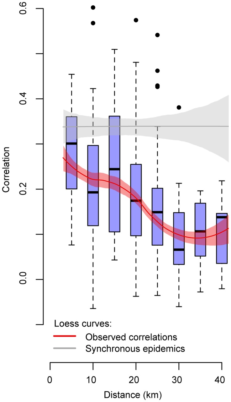
Figure 3. Correlation between epidemic curves.
Box plots of the correlation between the epidemic curves of pairs of village clusters and the distance between them (blue). Only village clusters with at least 40 cases were used in this analysis. Loess curves of the same data with 95% confidence intervals generated through 500 bootstrapped resamples (red). The grey line represents the correlation under the theoretical scenario of complete synchrony in case distribution across the whole district (generated by randomly reassigning the dates that cases occurred between all the cases, keeping the total number at any time point fixed).

