
Figure 2. Complementary cumulative distribution of segment lengths for each individual (color) and accumulated data of all subjects in the same group (black solid line), for the hypertensive (HT), normotensive (NT) and control (C) groups.
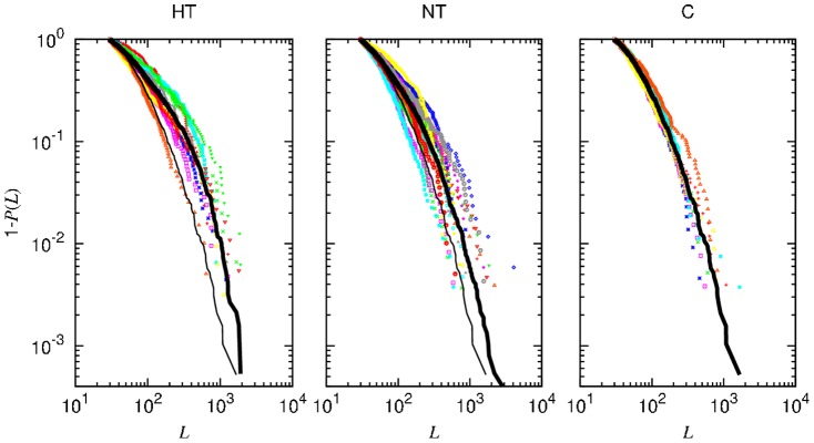
Drawn for comparison, the thin line in the first two panels (HT and NT) reproduces the accumulated data curve for the control group (C).