. 2014 Sep 8;3:e04395. doi: 10.7554/eLife.04395

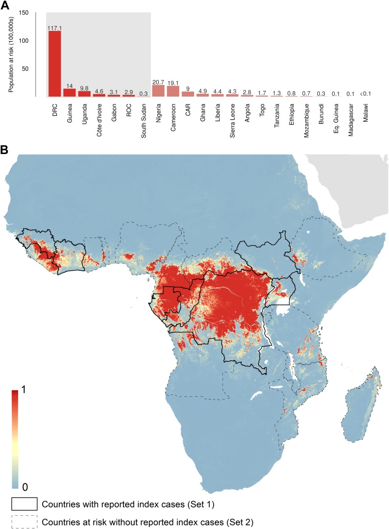
Figure 5. Predicted geographical distribution of the zoonotic niche for Ebola virus.

(A) Shows the total populations living in areas of risk of zoonotic transmission for each at-risk country. The grey rectangle highlights countries in which index cases of Ebola virus disease have been reported (Set 1); the remainder are countries in which risk of zoonotic transmission is predicted, but in which index cases of Ebola have not been reported (Set 2). These countries are ranked by population at risk within each set. The population at risk Figure in 100,000 s is given above each bar. (B) Shows the predicted distribution of zoonotic Ebola virus. The scale reflects the relative probability that zoonotic transmission of Ebola virus could occur at these locations; areas closer to 1 (red) are more likely to harbour zoonotic transmission than those closer to 0 (blue). Countries with borders outlined are those which are predicted to contain at-risk areas for zoonotic transmission based on a thresholding approach (see ‘Materials and methods’). The area under the curve statistic, calculated under a stringent 10-fold cross-validation procedure is 0.85 ± 0.04. Solid lines represent Set 1 whilst dashed lines delimit Set 2. Areas covered by major lakes have been masked white.

DOI: http://dx.doi.org/10.7554/eLife.04395.009

Figure 5.

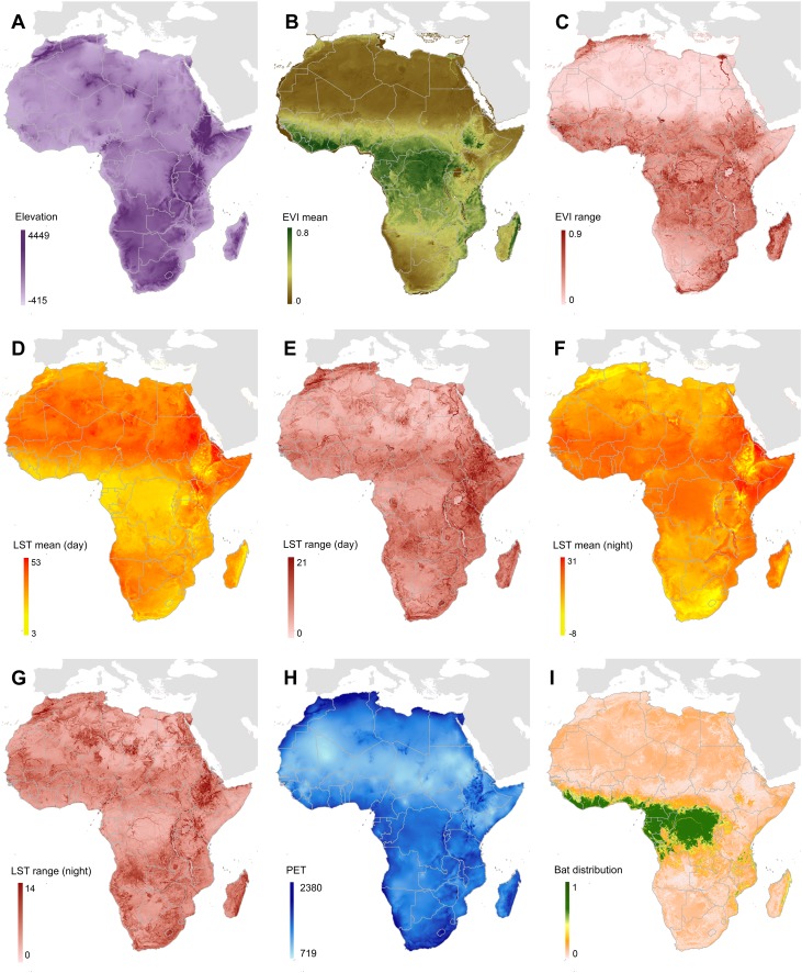
Figure 5—figure supplement 1. Covariates used in predicting zoonotic transmission niche of Ebola.

Figure 5—figure supplement 1.

(A) Displays elevation across Africa measured in metres, relative to sea level. (B and C) Show enhanced vegetation index (EVI) values (mean and spatial range respectively) on a scale from 0 to 1. (DG) Display land surface temperature (LST) (mean and spatial range for day and night respectively) measured in degrees Celsius. (H) Shows potential evapotranspiration (PET) for Africa, in millimetres per month and (I) gives the composite, relative probability of occurrence of the three suspected reservoir bat species. For details of how each of these covariate layers was derived see ‘Materials and methods’.
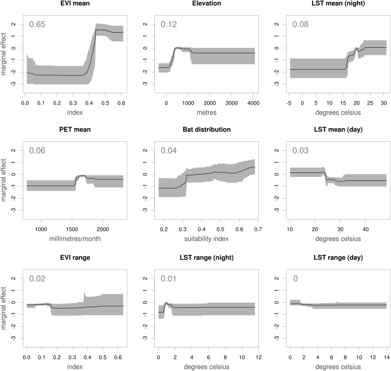
Figure 5—figure supplement 2. Marginal effect plots for each covariate used in the Ebola virus distribution model.

Figure 5—figure supplement 2.

Each panel illustrates the marginal effect (averaging over the effects of other covariates) that changes in each of the covariates has on the predicted relative probability of occurrence of zoonotic Ebola virus transmission. Grey regions and solid lines give the 95% confidence region (a metric of uncertainty) and mean value calculated across all 500 submodels. The mean relative contribution of the covariate to the model (the proportion of iterations in which the covariate was selected by the model-fitting algorithm, indicating sensitivity to the covariates) is given as an inset number. The dependency plots are ordered by mean relative contribution of the covariate. EVI = enhanced vegetation index, LST = land surface temperature and PET = potential evapotranspiration.
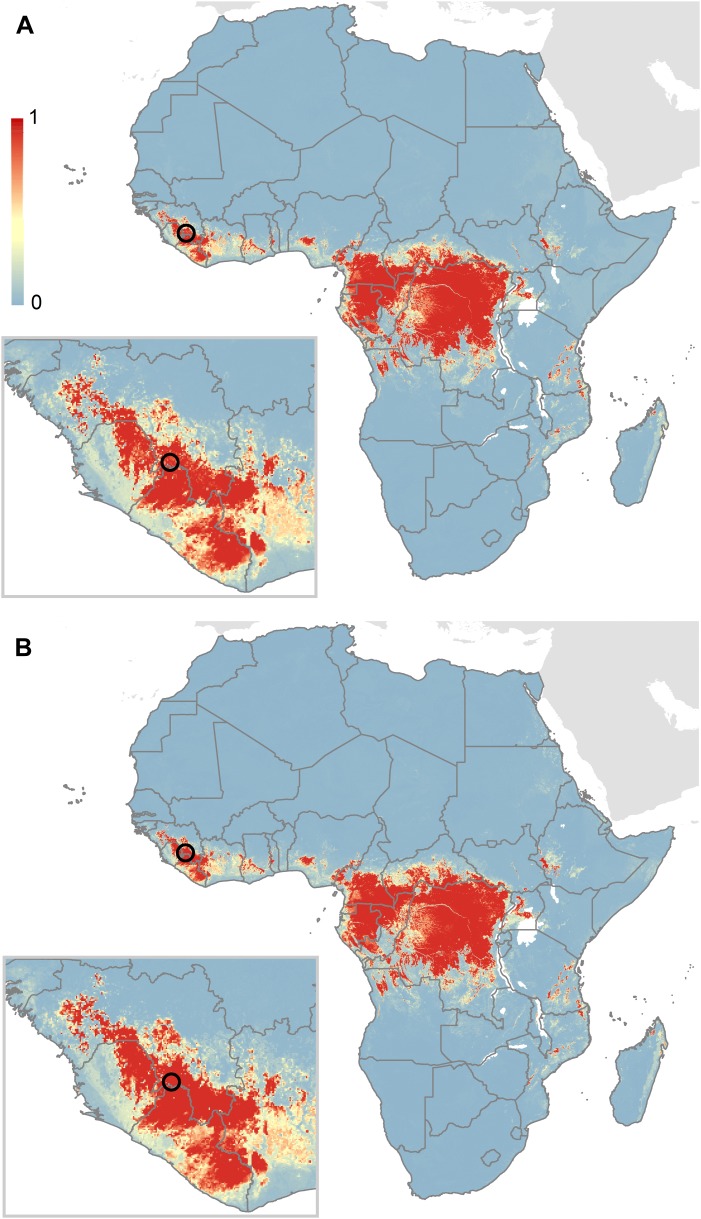
Figure 5—figure supplement 3. Comparison of predictions for zoonotic niche of Ebola virus excluding the Guinea outbreak.

Figure 5—figure supplement 3.

(A) Shows the predicted zoonotic niche excluding the index case for the Guinea outbreak from the dataset used to train the model. (B) Shows the prediction when including the Guinea data in the model (the model presented in Figure 5). The circle depicts the location of the Guinean index case (#23 in Table 1). As per Figure 5, the scale reflects the relative probability that zoonotic transmission of Ebola virus could occur at these locations; areas closer to 1 (red) are more likely to harbour zoonotic transmission than those closer to 0 (blue).