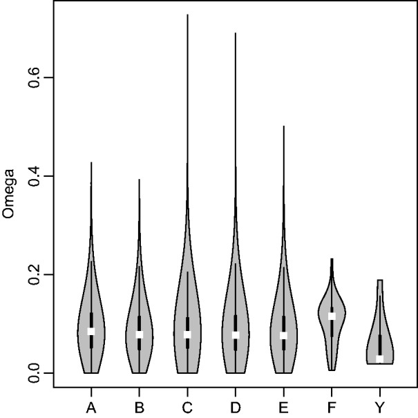
Fig. 5.

Violin plots (kernel density plot overlaid on boxplot) of ω for all 1:1 orthologs and Y-linked genes separated by chromosome arm. Kernel density is depicted in the shaded gray polygon. Within the kernel density plot, the top and bottom edges of the box represent the third and first quartile, respectively, and the median values are highlighted in white.
