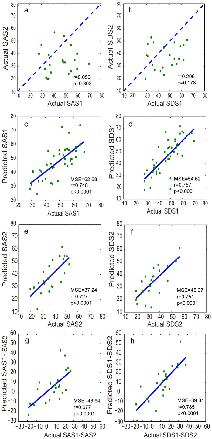
Figure 2.
(a–b) Scatterplots depicting the relationship between the SAS (left) and SDS scores (right) at Times 1 and 2. The dashed lines represent 45°, which implies no change between Times 1 and 2. (c–f) Scatterplots depicting the correlation between the predicted SAS and actual SAS scores at Times 1 (c) and 2 (e) and between the predicted SDS and actual SDS scores at Times 1 (d) and 2 (f). (g–h) Scatterplots depicting the correlation between the difference in the predicted SAS scores at Times 1 and 2 (the predicted SAS1-SAS2) and the difference in the actual SAS scores at Times 1 and 2 (the actual SAS1-SAS2) (g) and the correlation between the difference in the predicted SDS scores at Times 1 and 2 (the predicted SDS1-SDS2) and the difference in the actual SDS scores at Times 1 and 2 (the actual SDS1-SDS2) (h).

