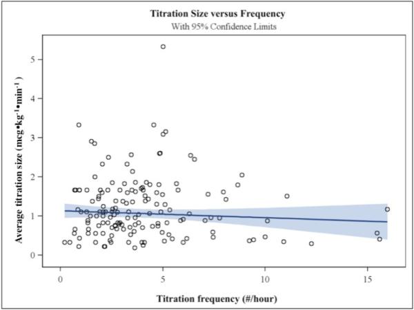
Figure 5.
is a scatterplot showing the relationship between titration size (in mcg•kg−•min−, on the y-axis) and titration frequency (in titrations/hour, on the x-axis). A regression line (slope=-0.0165) is drawn in dark blue, with light blue indicating 95% confidence intervals. There was no significant relationship between titration size and frequency (p=0.275). The SAS PROC/ROBUSTREG regression provides a more accurate estimate for the slope when there are prominent outliers and leverage points, as occurs in these data.

