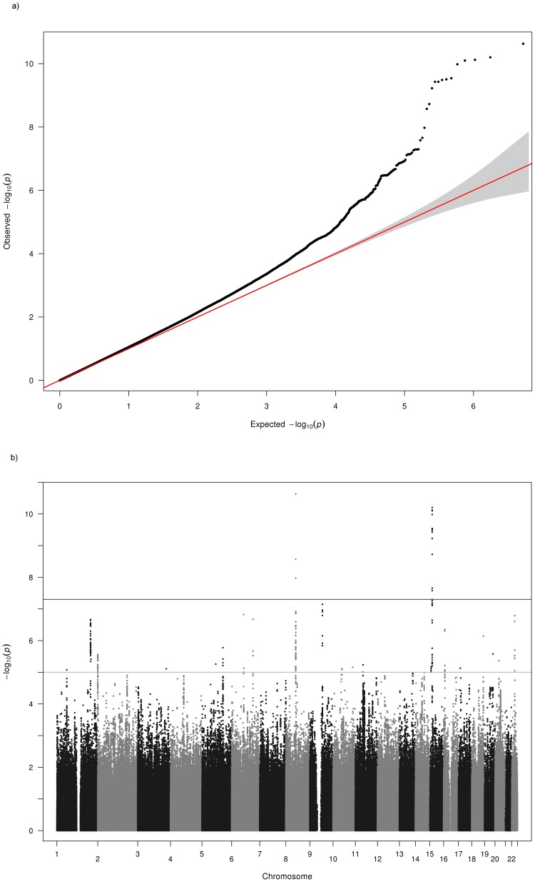
Figure 2. Q-Q and Manhattan Plots for the hyperopia analysis of all cohorts.
a) Q-Q plot for association between all SNPs analyzed and hyperopia in the meta-analysis. Each dot represents an observed statistic (defined as -log10 P) versus the corresponding expected statistic. The red line corresponds to the null distribution. b) Manhattan plot for association between all SNPs analyzed and hyperopia in the meta-analysis. Each dot represents an observed statistic (defined as -log10 P). The darker gray line corresponds to the genome-wide significance threshold and the lighter gray line represents the suggestive threshold.

