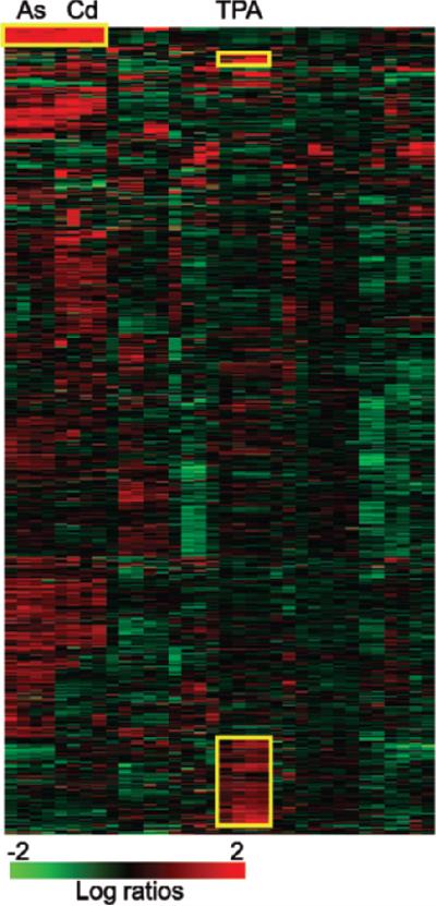
Figure 4.
Heat map generated by clustering gene-expression ratio data (Amundson et al. 2005). Gene-expression ratios (treated/control) are represented as colors according to the scale at the bottom of the figure, with brighter red indicating more induction of expression, and brighter green indicating more suppression of expression after treatment. Each horizontal row represents the expression pattern of an individual gene across all experiments, and each vertical column represents the expression pattern of all genes within an individual experiment. Clustering has been used to arrange the experiments so that those producing the most similar pattern of gene-expression changes across all genes are closest together. Thus, for instance, all samples treated with metals (arsenite [As] and cadmium chloride [Cd]) appear next to each other, as do all samples treated with 12-O-tetradecanoylphorbol 13-acetate (TPA). The genes have also been clustered, so that those with the most similar response across all experiments are again placed next to each other. This reveals some specific patterns, such as those that have been marked with yellow boxes and discussed in the text. For instance, the genes in cluster A are mostly metallothioneins, which clearly respond much more strongly to metal exposure than to the other stresses studied.

