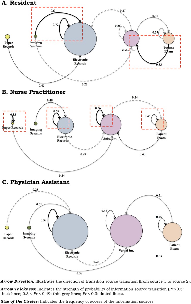
Figure 2.
The switching between the various sources (depicted as circles) and their relative probability of transition (depicted by arrow direction and value directly above) is shown. The size of the circles shows the frequency of the use of a source; the thickness of the arrows shows the relative probability of switching from one source to another. For example, for residents (A), the probability of transitioning (ie, switching) from ‘imaging systems’ to ‘electronic records’ is 0.6. The square dashed lines show the prominent transitions from the residents and the physician assistants.

