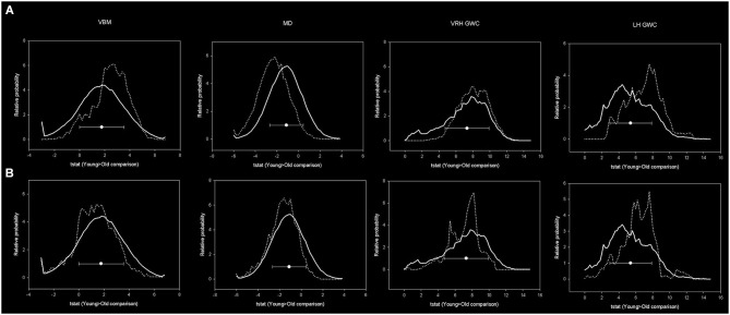
Figure 7.
Histograms showing distribution of age-related effects across predefined masks. In the upper row, the continuous line represents the distribution of the age-effect across all brain voxels while dotted line represents the voxels included within mPFC-PCU correlates mask. In the lower images the dotted line represents the age-related distribution within predefined DMN areas. Bins have 0.2 width while the Y axis has been scaled to represent a relative distribution. Circles represent the means and error bars the standard deviations of age-related effects of all brain voxels.

