Figure 3.
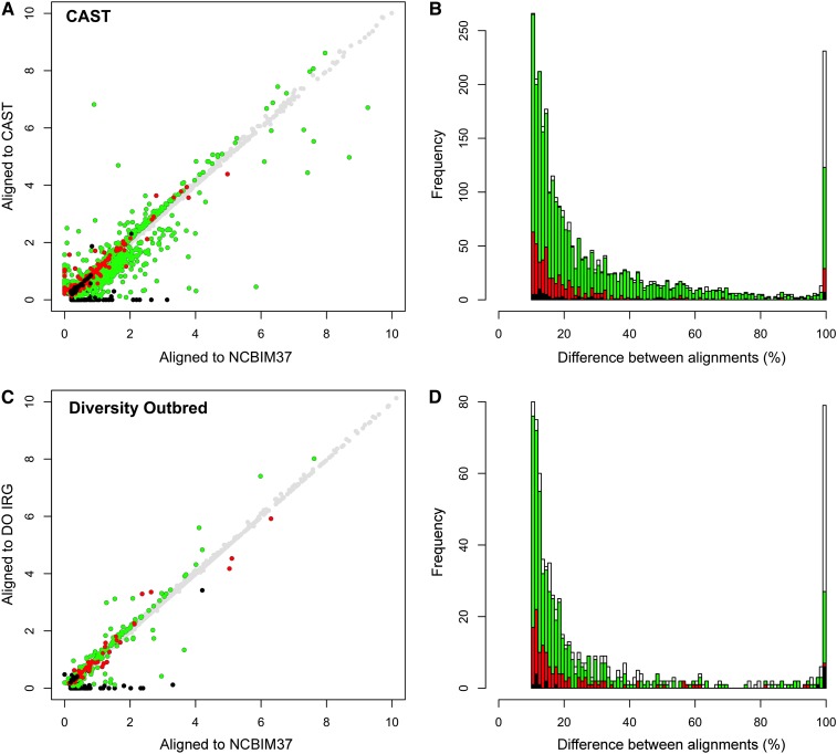
Gene-level abundance estimates in real data are improved by the individualized alignment strategy. (A) Gene-level abundance estimates are plotted for one CAST sample after alignment to the NCBIM37 (x-axis) and CAST transcriptomes (y-axis). Points are colored based on the difference between alignments and the results of the simulation study (n = 11,964 total genes). Gray circles denote genes with abundance estimates that differ by <10% between alignment strategies (n = 8980). Green denotes genes that differ in the real data by >10% between alignment strategies and for which the alignment to CAST improved the abundance estimate in the simulation study (n = 2242). Red denotes genes that differ by >10% in the real data and for which alignment to NCBIM37 improved the abundance estimate in the simulation study (n = 439). Black denotes genes that differ by >10% in the real data but for which the two alignment strategies yielded the same abundance estimates in the simulation study (n = 71). (B) The differences in gene-level abundance estimates between alignment strategies in the real CAST data are plotted as a stacked histogram. The percentage of difference between CAST and NCBIM37 alignments is plotted on the x-axis, and the total number of genes with that difference is plotted on the y-axis. The same coloring conventions are used as in A. White bars denote genes that differ by >10% in the real data but that were not expressed above threshold in the simulated data set (n = 232). Differences were scaled to a maximum value of 100%. (C) Gene-level abundance estimates are plotted for one DO sample after read alignment to the NCBIM37 (x-axis) and individualized transcriptomes (y-axis). A total of 714 genes in the real data differ by >10% between alignment strategies (n = 714/12,248), of which 432 gene estimates were improved by alignment to the individualized transcriptome in the simulation study (green circles), 124 were improved by alignment to NCBIM37 in the simulation (red circles), and 16 yielded the same gene estimate by both alignment strategies in the simulation study (black circles). (D) The difference in gene-level abundance estimates between alignment strategies in the real DO data are plotted as a stacked histogram. The percentage of difference between DO and NCBIM37 alignment is plotted on the x-axis, and the total number of genes with that difference is plotted on the y-axis. The same coloring conventions are used as in C. White bars denote genes that differ by >10% in the real data but that were not expressed above threshold in the simulation study (n = 142).

