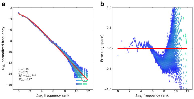
Fig. 1.

a Relationship between frequency rank (x-axis) and (normalized) frequency (y-axis) for words from the American National Corpus. This is plotted using a two-dimensional hexagonal histogram. Bins are shaded blue to green along a logarithmic scale depending on how many words fall into the bin. The red line shows the fit of Eq. 2 to these data. b Frequency rank versus the difference (in log space) between a word’s frequency and the prediction of Eq. 2. This figure shows only a subset of the full y range, cropping some extreme outliers on the right-hand side of the plot in order to better visualize this error for the high-frequency words
