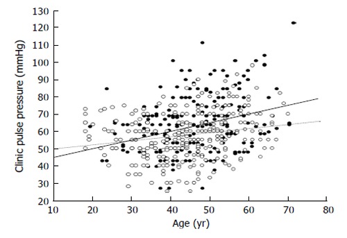
Figure 6.

Scatterplot showing the relationship between age and pulse pressure in subjects with (black circles) and in those without (white circles) metabolic syndrome. The calculated regression lines for the former (continuous line) and the latter patients (dotted line) were also shown. The difference regarding the slopes of the two regression lines was statistically significant (P = 0.01).
