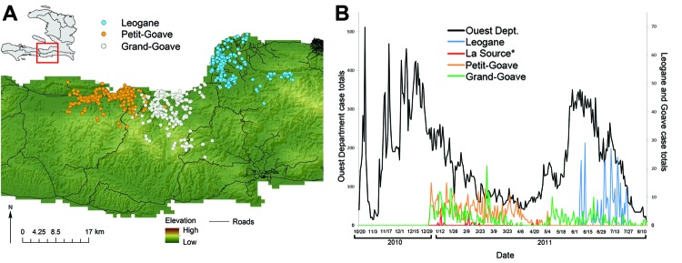
Figure 1.

Findings of the Cooperative Cholera Mapping Project in Haiti, 2011. A) Geographic distribution of household cholera cases per day. B) Temporal pattern, color-coded by community, compared with reported cases in the Ouest Department (black). Color coding of map symbols in A correspond to line colors in B. La Source cases (n = 25) are plotted but not mapped.
