
Figure 3.
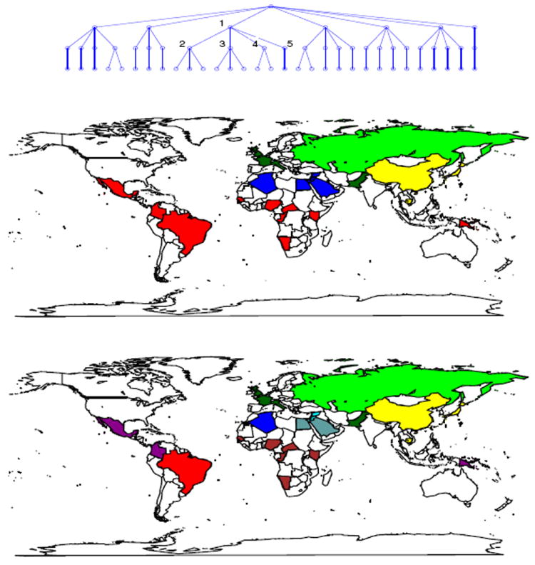
Summary of cell-line results. Top: inferred tree structure. Middle: layer-2 association of countries with nodes (denoted by colors). Bottom: layer-3 association of countries with nodes (denoted by colors). As examples, consider the nodes numbered on the tree (top). On layer-2, node 1 is represented as red in the middle map (Central South America and Central South Africa). On layer-3, node 2 is represented as purple (Mexico and Columbia); node 3 is represented as brown (Central South Africa); node 4 has no corresponding color because none of the countries in the map has majority of data clustered to it; and node 5 is represented as red (Brazil).