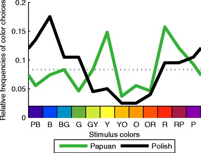
Fig. 2.

Cultural differences. Relative frequencies of favorite color choices are shown along the y-axis. The x-axis represents stimulus colors going from purple-blue (PB) to purple (P). For illustration, colors along the x-axis correspond to the RGB values of the stimulus colors. Industrialized Polish (black curve) and remote, nonindustrialized Papuan (green curve) observers differ strongly in their color preferences. The dotted gray curve corresponds to chance level. For least favorite choices, see Fig. S2. Polish observers tend to prefer bluish, Papuan observers red and yellow colors
