
Figure 5.
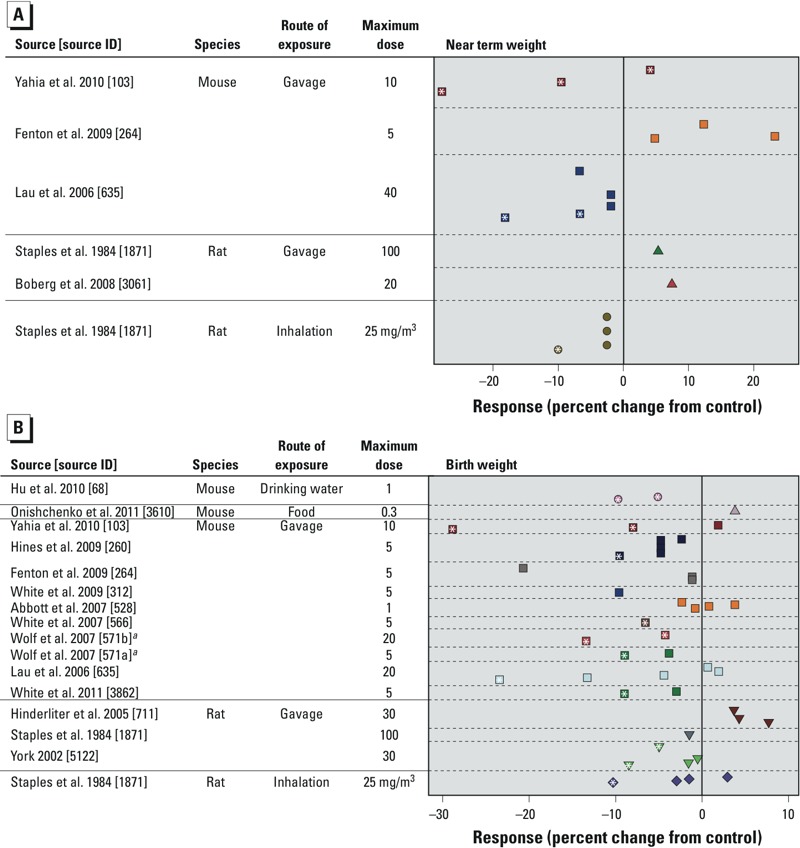
Combined scatter plots of response for each tested dose of PFOA for all included mammalian studies. Response was measured as the percentage of weight change for progeny (A) near-term or (B) at birth. Each color represents a different study (separated by dashed lines), and each symbol represents a different species or exposure route category. Multiple symbols of the same color represent responses at multiple tested doses within the same study. Doses are given in mg/kg BW/day unless otherwise specified. For each study, doses decrease as the y-axis increases and are scaled appropriately (i.e., larger vertical gaps indicate larger gaps between doses); the minimum dose for all studies is zero. See Supplemental Material, Tables S46 and S47, for the 95% CIs for the point estimates shown in the figure. aStudy split into two data sets: a) cross-foster (exposure on GDs 1–17), and b) windows of sensitivity (exposure groups for GDs 7–17, GDs 10–17, GDs 13–17, and GDs 15–17). *(Within symbols), p < 0.05 compared with the control group.