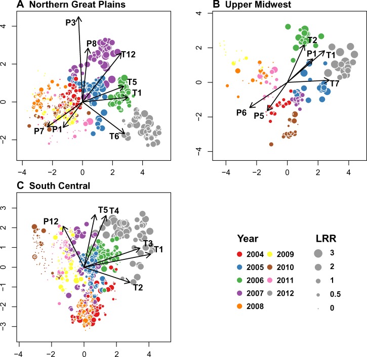
Figure 3.
Biplots of PLS regression analysis of the LRR of human WNV disease versus monthly climatic anomalies. The x and y axes represent latent variables from the PLS models. Circles represent the locations of county/year combinations in climate space, and circle size is proportional to LRR. Arrows represent the relative correlations of climate variables with each PLS axis. (A) NGP. (B) UM. (C) SC. Numbers represent months (1 = January, 2 = February, etc.). P = precipitation; T = temperature.

