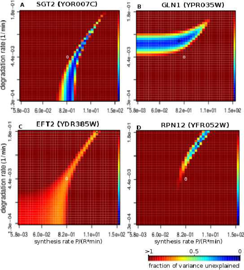
Figure 4. Parameter landscapes exploring uniqueness of rate prediction.
Four examples of parameter landscape profiles under diamide stress. A–B show the two most common profiles. Each point represents a certain combination of synthesis rate ks and degradation rate kd, and the color represents the quality of the fit that our model produces given these parameters. The quality of fit is given in fraction of variance unexplained (fvu) with darkest blue corresponding to values close to 0 (best fit) and the darkest red representing all fits with fvu greater than or equal to 1.0. The rest of the values fall in between as shown on the color scale on the rightmost column of every heatmap. C presents an example of a gene for which the fit is of approximately the same quality for a wide range of ks and kd values, and D shows an example where the solution is rather unique with very few additional solutions. The black circle on each heatmap represents the parameters that optimize the prediction (reported ks and kd values), and the white circle marks the center of the heatmap.

