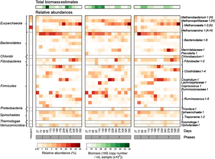
Figure 2.
Microbial community composition and synchronised dynamics. This heatmap shows the total biomass estimates and relative abundance of the most dominant microbial populations (>5% relative abundance in at least one of the samples) in the three reactors (AD1, AD2 and AD3) at 14 time points. Different populations were associated with the three performance phases and changes in membership occurred in parallel in the three reactors over time. Taxonomy was determined at the phylum level (left column) and at the lowest possible assignment (right column). H: hydrogenotrophic methanogens; A: acetoclastic methanogens. Darker colour intensity indicates a higher total biomass estimate (green) or relative abundance (red).

