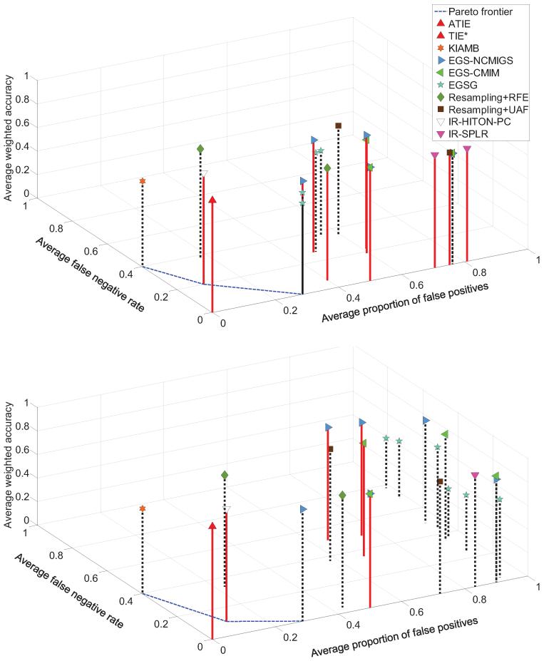
Figure 14.
Results for average classification performance (weighted accuracy), average false negative rate, and average proportion of false positives that were obtained in TIED (top figure) and TIED1000 (bottom figure) data sets. The style and color of a vertical line connecting each point with the plane shows whether the average SVM classification performance of a method is statistically comparable with the MAP-BN classifier in the same data sample (red solid line) or not (black dotted line). The Pareto frontier was constructed based on the average false negative rate and the average proportion of false positives over the comparator methods (i.e., non-TIE*). Results of TIE* and iTIE* were identical in both data sets.

