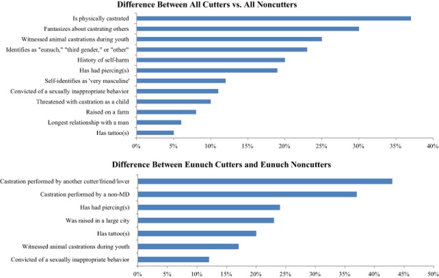
Figure 2.
The plots above are designed to help visualize the most significant differences in the comparison between (i) all cutters (n = 98) vs. all noncutters (n = 2,773) who responded to our survey (top) and (ii) all eunuch cutters (n = 44) vs. eunuch noncutters (n = 234) (bottom). Along the X-axis are the percentage difference in a particular trait between the two groups compared. In all of these cases the greater percentage is with the cutters. The traits that are compared are arranged along the Y-axis and listed in order of the traits with the most to least difference between the compared groups. Only features that were different in the statistical analyses at P < 0.05 are plotted here. The level of statistical difference is given in Table 1 and Table 2, respectively.

