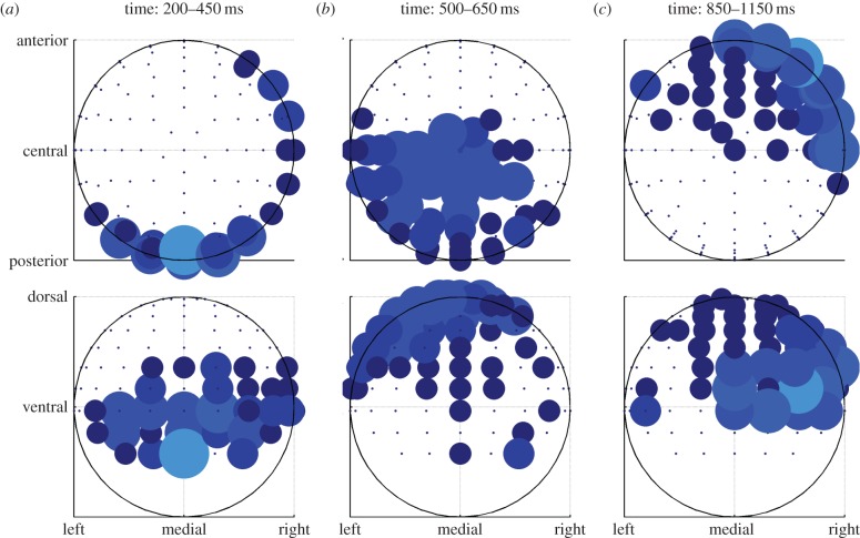
Figure 5.
Results of the analysis of the chosen value (a–c). Same data as in figure 4, but aggregated over time windows and plotted on scalp maps. Top row shows transverse view, bottom row coronal view. Bigger dots mean more significant time bins in the time window. (Online version in colour.)

