
Figure 7.
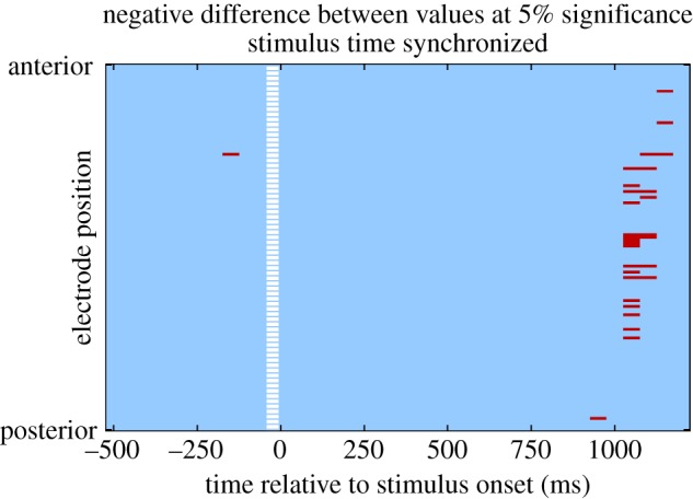
Results from the analysis of the value difference between unchosen and chosen options. Each row in the result map represents an electrode, and each column a 50 ms time bin. Electrodes are ordered according to anterior position, so that the most anterior electrodes are at the top of the map, and the most posterior at the bottom. The white-dashed line represents the time of stimulus. Red (dark in print version) indicates significant correlation with value difference at p < 0.05 corrected. (Online version in colour.)