
Figure 8.
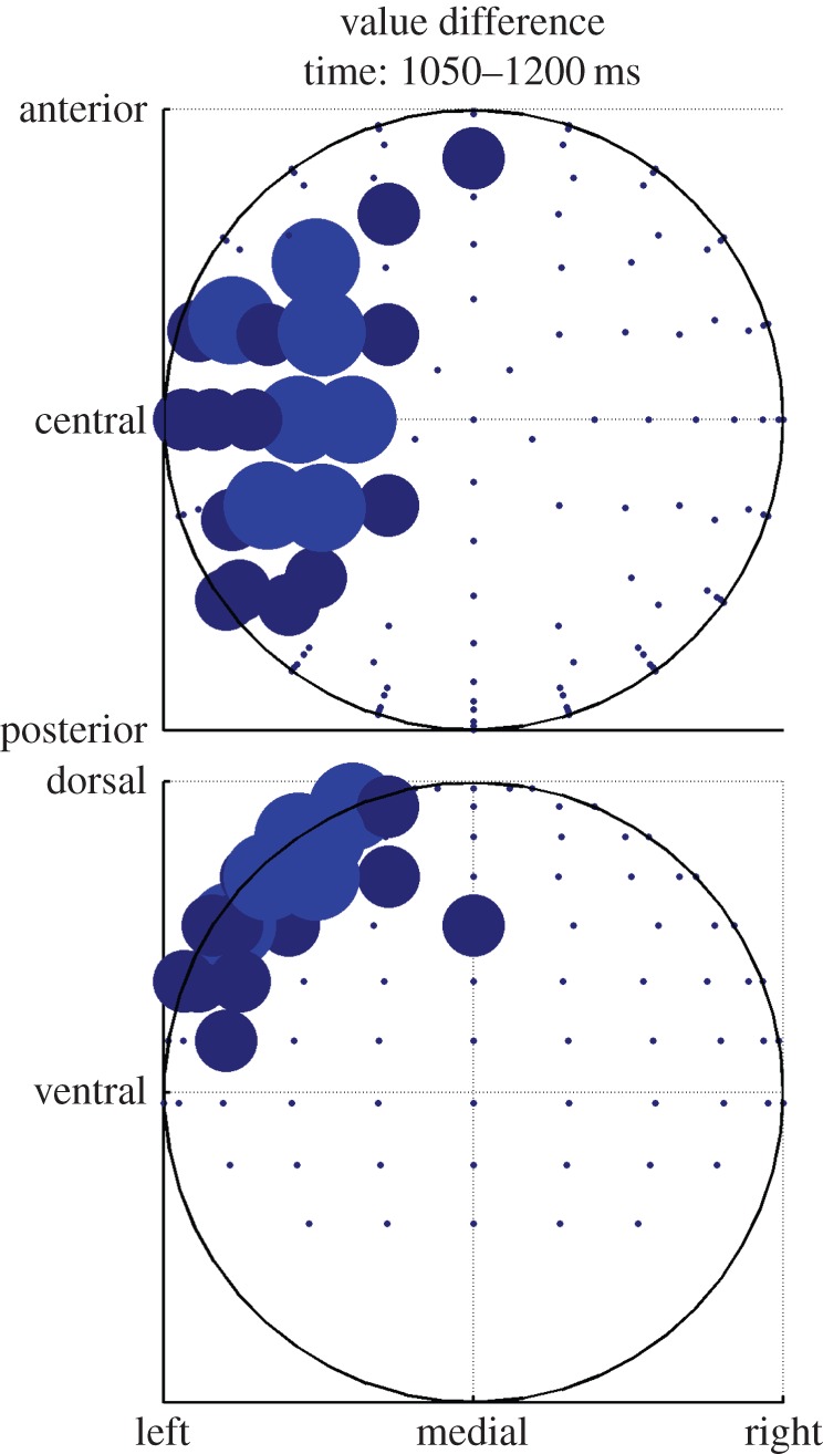
Same data as in figure 7, but aggregated over the time window showing significant correlation and plotted on a scalp map. Top shows transverse view, bottom coronal view. Bigger dots mean more significant time bins in the time window. (Online version in colour.)